Looking to upgrade your website with stunning, responsive buttons—without writing a line of code from scratch? You’re in the right place. In this article, we’ve handpicked 10 beautiful, ready-to-use CSS buttons that you can copy and paste directly into your project. Whether you’re building a landing page, form, or interactive UI, these buttons are designed to look great and work seamlessly across all modern browsers. Let’s dive in and give your site that extra touch of style it deserves!
Hey I am Yasfa Yasmin, And Here are my some buttons design,
1. Cartoon Flat Button
This stylish Cartoon Flat Sign In button features a warm, welcoming background with a simple black border and playful drop shadow — giving it a clean, hand-drawn look. It’s designed with minimal HTML and CSS, making it lightweight and easy to integrate into any modern website. Perfect for login pages, personal portfolios, or applications aiming for a soft, friendly UI.
code
html
<button class="clone-btn">Sign in</button>css
.clone-btn {
  background-color: #facc9c;
  border: 1px solid black;
  padding: 10px 40px;
  font-family: sans-serif;
  font-size: 16px;
  color: black;
  cursor: pointer;
  box-shadow: 2px 2px 0px black;
}
2.Aurora Pulse Button
The Aurora Pulse button brings your UI to life with smooth gradients, subtle glow, and a slick hover shine. It’s modern, interactive, and just the right kind of extra to make your interface pop.
code
html
<button class="fancy-button">Click Me</button>
css
.fancy-button {
  position: relative;
  display: inline-block;
  padding: 14px 32px;
  font-size: 1rem;
  font-weight: 600;
  color: #fff;
  background: linear-gradient(135deg, #7b2ff7, #f107a3);
  border: none;
  border-radius: 12px;
  cursor: pointer;
  overflow: hidden;
  transition: transform 0.3s ease, box-shadow 0.3s ease;
  box-shadow: 0 4px 15px rgba(0, 0, 0, 0.2);
}

.fancy-button::before {
  content: "";
  position: absolute;
  top: 0;
  left: -75%;
  width: 200%;
  height: 100%;
  background: linear-gradient(120deg, rgba(255,255,255,0.2), rgba(255,255,255,0));
  transform: skewX(-20deg);
  transition: left 0.5s ease;
}

.fancy-button:hover {
  transform: scale(1.05);
  box-shadow: 0 8px 25px rgba(0, 0, 0, 0.3);
}

.fancy-button:hover::before {
  left: 100%;
}
3. Hover Glow Buttons
Meet Your New Hover Glow Button:
Picture this: A sleek, midnight-black rectangle with this cool electric purple outline that just whispers “click me.” It’s not shouting at visitors, but there’s this sophisticated vibe that makes you curious about what’s behind it.
Perfect For:
Your “Read More” sections, email signup prompts, or that special offer you really want people to notice. It’s basically that well-dressed friend at the party who attracts people just by being cool, not loud.
html
<button class="shine-btn">Hover Effect</button>css
.shine-btn {
  padding: 15px 40px;
  background: #0a0a0a;
  color: #f0f0f0;
  border: 2px solid #4a00e0;
  border-radius: 8px;
  font-size: 18px;
  font-weight: 600;
  letter-spacing: 1px;
  cursor: pointer;
  position: relative;
  overflow: hidden;
  transition: all 0.3s ease;
}

.shine-btn:hover {
  background: #4a00e0;
  color: #fff;
  box-shadow: 0 0 20px #4a00e0, 0 0 40px #8e2de2;
  transform: translateY(-3px);
}

.shine-btn::before {
  content: "";
  position: absolute;
  top: 0;
  left: -100%;
  width: 100%;
  height: 100%;
  background: linear-gradient(90deg, transparent, rgba(255,255,255,0.2), transparent);
  transition: 0.5s;
}

.shine-btn:hover::before {
  left: 100%;
}
4. Pastel Pop Buttons
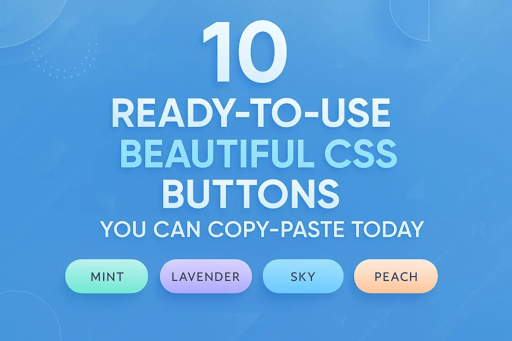
These Pastel Pop Buttons have a super cute and minimalistic design that makes them really fun to click. I used soft, sweet colors like peach and pink to give off a playful, lovable, and clean vibe.
Perfect for:
- Landing pages that need friendly CTAs
- SaaS dashboards where soft UI = less stress
- Portfolios & creative sites that want subtle flair
- Wellness/e-commerce projects going for calm vibes
- Anywhere you’d use a “Download” or “Sign Up” button
Just pick a color (mint for safe actions, peach for urgency) and watch them blend into your light-themed designs like they belong. 🎨✨
Code
html
<div class="btn-container">
  <button class="btn mint">Mint</button>
  <button class="btn lavender">Lavender</button>
  <button class="btn sky">Sky</button>
  <button class="btn peach">Peach</button>
</div>
css
.btn {
  padding: 12px 28px;
  border: none;
  border-radius: 30px;
  font-family: 'Segoe UI', sans-serif;
  font-weight: 600;
  font-size: 16px;
  cursor: pointer;
  transition: all 0.3s ease;
  margin: 10px;
  box-shadow: 0 4px 8px rgba(0,0,0,0.1);
  color: #333;
  text-transform: uppercase;
  letter-spacing: 1px;
  position: relative;
  overflow: hidden;
}

.btn:after {
  content: '';
  position: absolute;
  top: 0;
  left: 0;
  width: 100%;
  height: 100%;
  background: linear-gradient(rgba(255,255,255,0.3), transparent);
  border-radius: 30px;
}

.btn:hover {
  transform: translateY(-3px);
  box-shadow: 0 6px 15px rgba(0,0,0,0.15);
}

.btn:active {
  transform: translateY(1px);
}

.mint {
  background: linear-gradient(to bottom, #a8e6cf, #7fd8be);
}

.lavender {
  background: linear-gradient(to bottom, #d4c1ec, #b8a1d9);
}

.sky {
  background: linear-gradient(to bottom, #a3d9ff, #7bc6ff);
}

.peach {
  background: linear-gradient(to bottom, #ffd8be, #ffc4a3);
}
5.Glassmorphic Buttons
Lightweight, airy buttons with a frosted glass effect. Hover to see the subtle elevation effect.
Design Features
This glassmorphic button design includes:
- Frosted glass effect using semi-transparent backgrounds with backdrop filters
- Light color palette with soft pastel gradients
- Elevation effect on hover with subtle shadow changes
- Smooth animations for hover and active states
- Responsive layout that adapts to different screen sizes
- Emoji icons for visual enhancement
- Soft inner glow for a premium look
- Subtle text transformation for emphasis
- Airy spacing and rounded corners
- Light background gradient to complement the buttons
Code
html
<div class="buttons-container">

      <button class="glass-btn btn-2">
        <span class="icon">🌸</span> Blossom
      </button>
      <button class="glass-btn btn-3">
        <span class="icon">🌿</span> Mint
      </button>
      <button class="glass-btn btn-4">
        <span class="icon">🍑</span> Peach
      </button>
      <button class="glass-btn btn-5">
        <span class="icon">🦄</span> Lavender
      </button>

    </div>
css
<style>
    * {
      margin: 0;
      padding: 0;
      box-sizing: border-box;
    }

    body {
      min-height: 100vh;
      display: flex;
      justify-content: center;
      align-items: center;
      background: linear-gradient(135deg, #f5f7fa 0%, #e4edf5 100%);
      font-family: 'Segoe UI', system-ui, sans-serif;
      padding: 20px;
    }

    .container {
      max-width: 900px;
      width: 100%;
      padding: 40px;
      background: rgba(255, 255, 255, 0.7);
      backdrop-filter: blur(10px);
      border-radius: 24px;
      box-shadow: 0 15px 35px rgba(0, 0, 0, 0.05);
      text-align: center;
    }

    h1 {
      color: #5a67d8;
      margin-bottom: 10px;
      font-weight: 600;
      font-size: 2.8rem;
      letter-spacing: -0.5px;
    }

    .subtitle {
      color: #718096;
      font-size: 1.2rem;
      margin-bottom: 50px;
      max-width: 600px;
      margin-left: auto;
      margin-right: auto;
    }

    .buttons-container {
      display: flex;
      flex-wrap: wrap;
      justify-content: center;
      gap: 25px;
      margin-top: 40px;
    }

    .glass-btn {
      padding: 18px 40px;
      border: none;
      border-radius: 16px;
      font-size: 1.1rem;
      font-weight: 500;
      cursor: pointer;
      transition: all 0.3s ease;
      backdrop-filter: blur(10px);
      box-shadow:
        0 8px 20px rgba(0, 0, 0, 0.08),
        inset 0 2px 4px rgba(255, 255, 255, 0.7);
      position: relative;
      overflow: hidden;
      min-width: 180px;
      color: #4a5568;
      text-transform: uppercase;
      letter-spacing: 1px;
    }

    .glass-btn::before {
      content: '';
      position: absolute;
      top: 0;
      left: 0;
      width: 100%;
      height: 100%;
      background: linear-gradient(135deg, rgba(255, 255, 255, 0.4) 0%, rgba(255, 255, 255, 0.1) 100%);
      z-index: -1;
      border-radius: 16px;
    }

    .glass-btn:hover {
      transform: translateY(-5px);
      box-shadow:
        0 12px 25px rgba(0, 0, 0, 0.15),
        inset 0 2px 6px rgba(255, 255, 255, 0.8);
      color: #2d3748;
    }

    .glass-btn:active {
      transform: translateY(0);
    }

    .btn-1 {
      background: linear-gradient(135deg, rgba(166, 216, 255, 0.6) 0%, rgba(166, 216, 255, 0.3) 100%);
    }

    .btn-2 {
      background: linear-gradient(135deg, rgba(255, 200, 221, 0.6) 0%, rgba(255, 200, 221, 0.3) 100%);
    }

    .btn-3 {
      background: linear-gradient(135deg, rgba(200, 230, 201, 0.6) 0%, rgba(200, 230, 201, 0.3) 100%);
    }

    .btn-4 {
      background: linear-gradient(135deg, rgba(255, 223, 186, 0.6) 0%, rgba(255, 223, 186, 0.3) 100%);
    }

    .btn-5 {
      background: linear-gradient(135deg, rgba(225, 190, 231, 0.6) 0%, rgba(225, 190, 231, 0.3) 100%);
    }

    .btn-6 {
      background: linear-gradient(135deg, rgba(255, 245, 157, 0.6) 0%, rgba(255, 245, 157, 0.3) 100%);
    }

    .icon {
      margin-right: 10px;
      vertical-align: middle;
      font-size: 1.3rem;
    }

    @media (max-width: 768px) {
      .buttons-container {
        flex-direction: column;
        align-items: center;
      }

      .glass-btn {
        width: 100%;
        max-width: 300px;
      }
    }
</style>6.Sunrise Glow button design
A warm, inviting button with a coral-to-peach gradient that mimics a sunrise. On hover, it lifts slightly with a soft shadow, creating a sense of depth and interactivity. Perfect for call-to-action buttons that need to stand out.
code
html
<div class="btn-container">
  <button class="btn coral">Coral</button>
  <button class="btn teal">Teal</button>
  <button class="btn lavender">Lavender</button>
</div>
css
.btn-container {
  display: flex;
  gap: 20px;
  justify-content: center;
  padding: 30px;
}

.btn {
  padding: 15px 40px;
  border: none;
  border-radius: 50px;
  font-size: 18px;
  font-weight: 600;
  cursor: pointer;
  transition: all 0.4s ease;
  color: white;
  box-shadow: 0 4px 12px rgba(0,0,0,0.1);
  position: relative;
  overflow: hidden;
}

/* Coral Button */
.coral {
  background: linear-gradient(135deg, #FF7E5F, #FEB47B);
}

.coral:hover {
  transform: translateY(-5px);
  box-shadow: 0 8px 20px rgba(255, 126, 95, 0.4);
}

/* Teal Button */
.teal {
  background: linear-gradient(135deg, #009688, #4DB6AC);
}

.teal:hover {
  box-shadow:
    inset 0 0 0 2px white,
    0 0 0 4px rgba(0, 150, 136, 0.2);
}

/* Lavender Button */
.lavender {
  background: linear-gradient(135deg, #6A82FB, #A78BFA);
}

.lavender:hover::before {
  content: '';
  position: absolute;
  top: 0;
  left: 0;
  width: 100%;
  height: 100%;
  background: rgba(255,255,255,0.1);
  animation: shine 0.8s;
}

@keyframes shine {
  0% { transform: translateX(-100%) skewX(-20deg); }
  100% { transform: translateX(200%) skewX(-20deg); }
}
7. Gradient Glow Button
Description: A vibrant, eye-catching button with a smooth gradient transition from orange to yellow. It has a glowing shadow effect that intensifies on hover, along with a slight scale-up animation for an engaging interaction.
Best for: Call-to-action buttons, promotional sections, and lively interfaces.
Code
html
<div class="btn-container">
  <button class="btn glass">Glass</button>
  <button class="btn gradient">Gradient</button>
  <button class="btn border-pop">Border Pop</button>
</div>
css
/* Base Styles */
.btn-container {
  display: flex;
  gap: 20px;
  padding: 20px;
  justify-content: center;
}

.btn {
  padding: 15px 30px;
  border: none;
  border-radius: 8px;
  font-size: 16px;
  font-weight: 600;
  cursor: pointer;
  transition: all 0.3s ease;
  color: white;
  text-transform: uppercase;
  letter-spacing: 1px;
  position: relative;
  overflow: hidden;
}

/* Glass Button */
.glass {
  background: rgba(106, 27, 154, 0.5);
  backdrop-filter: blur(10px);
  border: 1px solid rgba(255, 255, 255, 0.2);
  box-shadow: 0 4px 6px rgba(0, 0, 0, 0.1);
}
.glass:hover {
  background: rgba(106, 27, 154, 0.7);
  transform: translateY(-3px);
  box-shadow: 0 6px 12px rgba(0, 0, 0, 0.15);
}

/* Gradient Button */
.gradient {
  background: linear-gradient(45deg, #FF512F, #F09819);
  box-shadow: 0 4px 15px rgba(240, 152, 25, 0.4);
}
.gradient:hover {
  background: linear-gradient(45deg, #F09819, #FF512F);
  box-shadow: 0 6px 20px rgba(240, 152, 25, 0.6);
  transform: scale(1.05);
}

/* Border Animation Button */
.border-pop {
  background: #2E7D32;
  box-shadow: 0 4px 6px rgba(0, 0, 0, 0.1);
}
.border-pop::before {
  content: "";
  position: absolute;
  top: -2px;
  left: -2px;
  right: -2px;
  bottom: -2px;
  border: 2px solid #2E7D32;
  border-radius: 10px;
  opacity: 0;
  transition: all 0.3s;
}
.border-pop:hover::before {
  opacity: 1;
  top: -5px;
  left: -5px;
  right: -5px;
  bottom: -5px;
}
.border-pop:hover {
  background: #1B5E20;
}
8. Auto Spacing button
A calming blue gradient button that gently lifts upward on hover, creating a soothing, airy effect. Perfect for actions that require a sense of tranquility, like “Save” or “Relax.”
Code
html
<div class="btn-container">
  <button class="btn-1">Serene</button>
  <button class="btn-2">Vibrant</button>
  <button class="btn-3">Elegant</button>
</div>
css
.btn-container {
  display: flex;
  gap: 20px;
  padding: 20px;
  justify-content: center;
}

button {
  padding: 15px 30px;
  border: none;
  font-size: 16px;
  font-weight: 600;
  border-radius: 50px;
  cursor: pointer;
  transition: all 0.4s ease;
  transform: translateY(0);
  box-shadow: 0 4px 8px rgba(0,0,0,0.1);
}

.btn-1 {
  background: linear-gradient(135deg, #6a93cb, #a4bfef);
  color: white;
}
.btn-1:hover {
  background: linear-gradient(135deg, #5a7fc1, #8aa8e8);
  transform: translateY(-3px);
  box-shadow: 0 6px 12px rgba(106, 147, 203, 0.4);
}

.btn-2 {
  background: linear-gradient(135deg, #ff7e5f, #feb47b);
  color: #5a2b1d;
}
.btn-2:hover {
  background: linear-gradient(135deg, #ff6b4a, #fe9f6b);
  transform: scale(1.05);
  box-shadow: 0 0 20px rgba(255, 126, 95, 0.6);
}

.btn-3 {
  background: transparent;
  color: #8a6d3b;
  border: 2px solid #d4c09e;
}
.btn-3:hover {
  background: #f4edde;
  letter-spacing: 2px;
  box-shadow: inset 0 0 10px rgba(212, 192, 158, 0.3);
}
9. Coral Sheading Buttons
This button design gives off a trustworthy feel and encourages more users to click.
Code
html
<div class="btn-container">
  <button class="btn coral">Coral</button>
  <button class="btn sapphire">Sapphire</button>
  <button class="btn emerald">Emerald</button>
</div>
css
.btn-container {
  display: flex;
  gap: 20px;
  justify-content: center;
  padding: 30px;
  background: #f8f9fa;
  border-radius: 12px;
}

.btn {
  padding: 14px 32px;
  border: none;
  border-radius: 50px;
  font-size: 16px;
  font-weight: 600;
  cursor: pointer;
  transition: all 0.4s ease;
  position: relative;
  overflow: hidden;
  box-shadow: 0 4px 15px rgba(0,0,0,0.1);
  letter-spacing: 1px;
  text-transform: uppercase;
}

/* Coral Button */
.coral {
  background: linear-gradient(45deg, #FF7E5F, #FEB47B);
  color: white;
}
.coral:hover {
  background: linear-gradient(45deg, #FF6B4A, #FF9E7D);
  transform: translateY(-3px);
  box-shadow: 0 8px 20px rgba(255, 126, 95, 0.4);
}

/* Sapphire Button */
.sapphire {
  background: linear-gradient(45deg, #3a7bd5, #00d2ff);
  color: white;
}
.sapphire:hover {
  background: linear-gradient(45deg, #2a65c4, #00c2f0);
  transform: scale(1.05);
  box-shadow: 0 8px 25px rgba(58, 123, 213, 0.35);
}

/* Emerald Button */
.emerald {
  background: linear-gradient(45deg, #0ba360, #3cba92);
  color: white;
}
.emerald:hover {
  background: linear-gradient(45deg, #089a56, #30b085);
  box-shadow:
    0 0 0 2px white,
    0 0 0 4px #0ba360;
  animation: pulse 1.5s infinite;
}

@keyframes pulse {
  0% { box-shadow: 0 0 0 0 rgba(11, 163, 96, 0.7); }
  70% { box-shadow: 0 0 0 12px rgba(11, 163, 96, 0); }
  100% { box-shadow: 0 0 0 0 rgba(11, 163, 96, 0); }
}
10. Clickey buttons
These three buttons are designed to give off an advanced, clicky vibe that makes users want to interact with them while browsing. They’re definitely modern, fun, and come with smooth animations that make clicking feel satisfying.
1. Moonlight Button
The Moonlight button features a dreamy purple-to-blue gradient that evokes a night sky. On hover, it gently floats upward with a soft shadow glow, creating a weightless effect. When clicked, it smoothly shrinks with a subtle press animation, mimicking the tactile response of a real button.
2. Sunset Button
Inspired by warm sunsets, this orange-to-peach gradient button playfully rotates and scales up on hover, adding a dynamic twist. The click animation intensifies the colors and snaps back with a satisfying bounce, making interactions feel lively and responsive.
3. Ocean Button
With a refreshing teal gradient, the Ocean button expands its letter spacing on hover, giving it a sleek, modern feel. When pressed, it skews slightly and shifts its gradient, simulating a wave-like motion—perfect for a fluid, energetic user experience.
code
html
<div class="buttons">
  <button class="btn-1">Moonlight</button>
  <button class="btn-2">Sunset</button>
  <button class="btn-3">Ocean</button>
</div>
css
.buttons {
  display: flex;
  gap: 20px;
  padding: 30px;
  background: #f8f9fa;
  justify-content: center;
}

button {
  padding: 18px 36px;
  border: none;
  font-size: 18px;
  font-weight: bold;
  border-radius: 50px;
  cursor: pointer;
  color: white;
  text-transform: uppercase;
  letter-spacing: 2px;
  position: relative;
  overflow: hidden;
  transition: all 0.3s;
  box-shadow: 0 8px 15px rgba(0,0,0,0.1);
}

/* Button 1 - Moonlight (Purple) */
.btn-1 {
  background: linear-gradient(45deg, #6a11cb, #2575fc);
}

.btn-1:hover {
  transform: translateY(-5px);
  box-shadow: 0 15px 20px rgba(106,17,203,0.4);
}

.btn-1:active {
  transform: scale(0.95);
  box-shadow: 0 3px 5px rgba(106,17,203,0.2);
}

/* Button 2 - Sunset (Orange) */
.btn-2 {
  background: linear-gradient(45deg, #ff7e5f, #feb47b);
}

.btn-2:hover {
  transform: rotate(-3deg) scale(1.05);
}

.btn-2:active {
  transform: rotate(0) scale(0.9);
  background: linear-gradient(45deg, #ff5e3a, #fe9e6b);
}

/* Button 3 - Ocean (Teal) */
.btn-3 {
  background: linear-gradient(45deg, #0cebeb, #20e3b2, #29ffc6);
}

.btn-3:hover {
  letter-spacing: 4px;
  background-size: 200% auto;
}

.btn-3:active {
  background-position: right;
  transform: skewX(-10deg);
}

/* Common Click Animation */
button:active {
  transition: all 0.1s;
}
That’s all Today, If you need some types of custom buttons or any type of design then please kindly comment down bellow.
Thanks for Reading–
Yasfa Yasmin